What Makes an Effective Logo?
by New Boston on April 5, 2016
Logo (noun, loh-goh): “A graphic representation or symbol of a company name, trademark, abbreviation, etc.” Essentially, it’s the visual representation of your company brand.
Paul Rand, one of the world’s greatest designers, states, “a logo is a flag, a signature, an escutcheon, a street sign. A logo does not sell (directly), it identifies. A logo is rarely a description of a business. A logo derives meaning from the quality of the thing it symbolizes, not the other way around. A logo is less important than the product it signifies; what it represents is more important than what it looks like. The subject matter of a logo can be almost anything.”
Logos are one of the most important graphic design elements, but the difference between a good logo and a bad one can really make a significant impact on your company or brand.
So, what makes an effective logo?
Memorable
Your logo should stand out and be recognized among others in your market. The best way to make your logo memorable is to make sure your brand lines up with the message and values you want to communicate to your customers. Keep in mind, your logo doesn’t need to say what your organization does, but it should say who you are.
Take the Starbucks logo for example. It has become one of the most recognizable brands across the globe, but has no reference to coffee. So, how do we recognize that logo as being an amazing, caffeine-filled cup of coffee? Through the message their logo portrays, built up over decades.
Long story short, Starbucks started in 1971 and—as with all businesses—they needed a logo. Their marketers knew they wanted to “capture the seafaring history of coffee and Seattle’s strong seaport roots,” so they landed on a seductive nautical-themed Siren. Not only does she signify the history of coffee and where Starbucks began, but she gives off an alluring feeling, inviting us in to bask in her warmth. The warmth of coffee!
Versatile
Your logo is going to appear on several different marketing pieces, such as brochures, web advertisements, business cards, etc., so you need to make sure your logo will translate across different platforms without losing clarity and value.
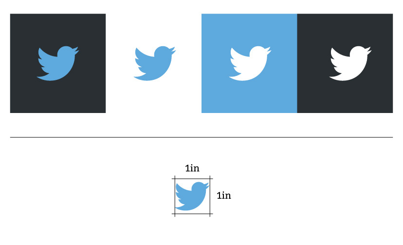
A good rule of thumb: if your logo is still identifiable at about an inch, you’re in the clear.
Another way to create a versatile logo is to design it in black and white first. This allows you to focus on the shapes and concepts, rather than color. A good logo works just fine in a black-and-white yearbook ad!
Evocative
One of the most important principles of a logo is the emotion it evokes. Emotions are created through color and typography and should be chosen wisely based on your target audience and company values.
For example, the Disney logo evokes a sense of happiness. The fun and playful typeface makes sense for a company that makes cartoons and animations for kids. However, a similar logo style for a lawyer or sales platform would not resonate well.
Timeless
In 30 years, will your logo still look as good as it did from the beginning? Probably not. One way to prevent your logo from becoming boring and outdated is to keep it simple. Don’t overdo it with special fonts and shadows. Ultra-thin fonts and flat shadows are totally in right now, but will probably not be a trend forever. Here at New Boston, we recommend clients refresh their logo every few years. This allows you to stay up to date with the latest trends without having to start over.
Be sure to check out my post on graphic design trends for 2016.
Simple
And lastly, keep it simple. Overusing textures, gradients, outlines, and other elements can hurt your logo by making it too distracting. A good rule of thumb: no more than two colors or two fonts.
Is it time your company got a logo refresh? Download our free ‘Checklist For An Effective Logo’ questionnaire to help you determine if it’s time for an upgrade!


