Graphic Design Trends for 2016
by New Boston on January 14, 2016
Looking back at some of the design trends from 2015, I think many visuals already seem old and outdated. It's the same old, same old–same style, same idea–everywhere you look!
In 2016, I think many trends will continue, but with a unique spin. Flat design will have depth; visual stories will leave audiences wanting more; and stock photos will be a thing of the past.
Here are the graphic design trends I foresee for 2016:
1. Flat 2.0
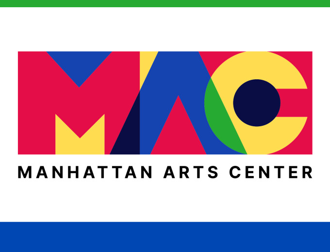
Flat design will grow even more popular in 2016, but with an added wrinkle. Strip all the fluff and frills and add depth through shadows, highlights, bold colors and simple shapes. Flat 2.0 will provide an opportunity for compromise.
Think visual simplicity without sacrificing signifiers. Big brands, like Google and Starbucks, have already started adopting flat design in their everyday branding. Less truly is more when it comes to visual design (especially for well established brands).

Examples: Monument Valley // Cybeer Bar // Dots
2. Hand-Drawn Illustrations
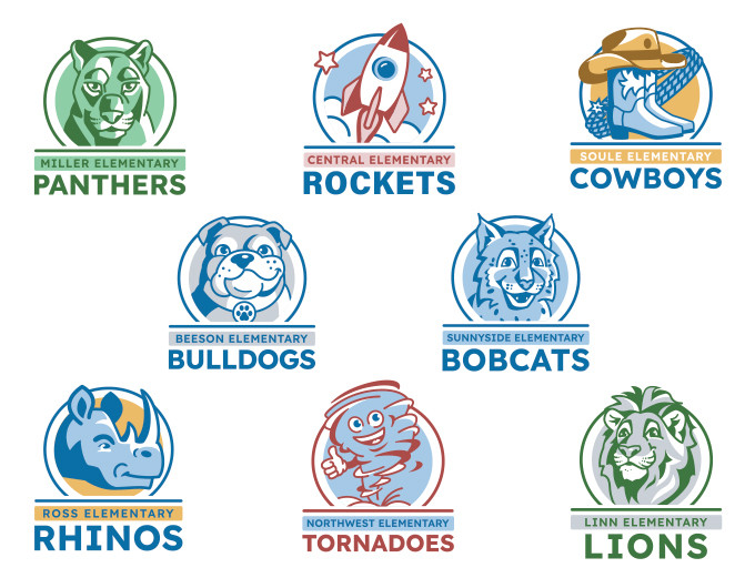
Hand-drawn or handmade illustrations, whether for logos or print pieces, convey a sense of honesty. The literal human touch in design creates personal meaning and builds a closer connection to a brand.
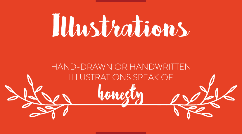
Examples: Gotta Love Photography // New Boston Staff // Tasty
3. Interactive/Visual Storytelling
Many brands have found that visual storytelling has encouraged greater engagement with their customers. According to Curve by Getty Images, "powerful visuals evoke emotions, driving a deeper engagement and more profound change in behavior."
Humans love stories. We like to imagine ourselves as specific characters who are thrown into larger-than-life situations and able to emerge victorious. When a good story ends, the reader (er, customer) is both satisfied and wanting more, and will continue to engage with the brand.
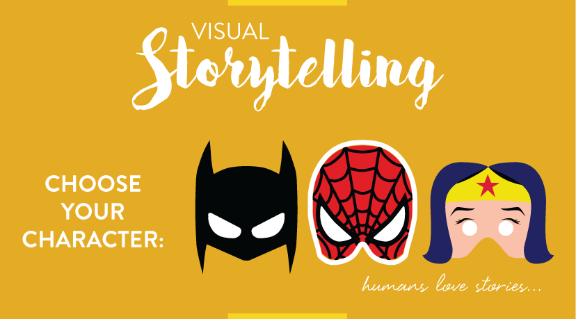
Examples: Slavery Footprint // Bellroy
4. Rich Color
Every year, Pantone announces a color for the year. This year's palette, according to Pantone, will be softer (think baby pink and light blue–cough, cough) to invoke "an inherent balance between a warmer embracing rose tone and [a] cooler tranquil blue, reflecting connection and wellness as well as a soothing sense of order and peace."
So, when thinking of color this year, think mid-80s—right around the time "The Golden Girls" premiered.
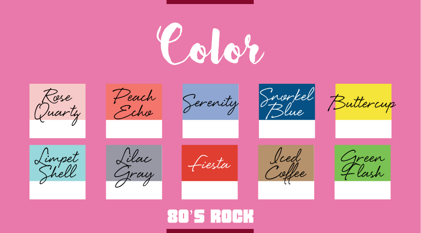
Examples: Circles Conference // Rightcolours
5. Artistic Typefaces
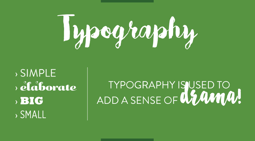
Typography is the key element to any good design and, when used effectively, does more than just enhance readability. Artistic typography was widely used in 2015, which has allowed many audiences to get used to and accept "not so standard" typefaces.
Whether simple or elaborate, big or small, typography today is used to add a sense of drama. I predict we will be seeing more type and font variety used to greater effect.
6. Infographics
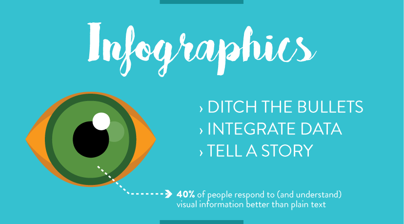
Infographics have become a vital piece for any digital marketing effort. Infographics show data in an appealing way, and we all know everyone loves to see good results. Studies show that "40% of people respond to (and understand) visual information better than plain text." So, ditch the bullet points and cute icons and integrate data in a more visual way.
Examples: What font is best for me? // Imaginary Factory // Distance to Mars
7. Modern Retro
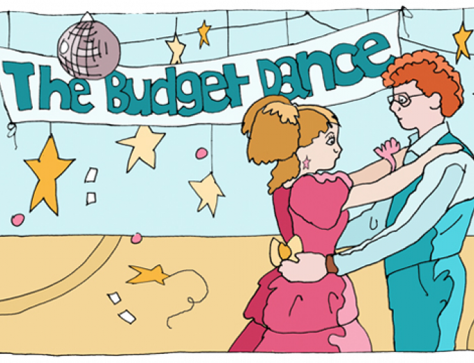
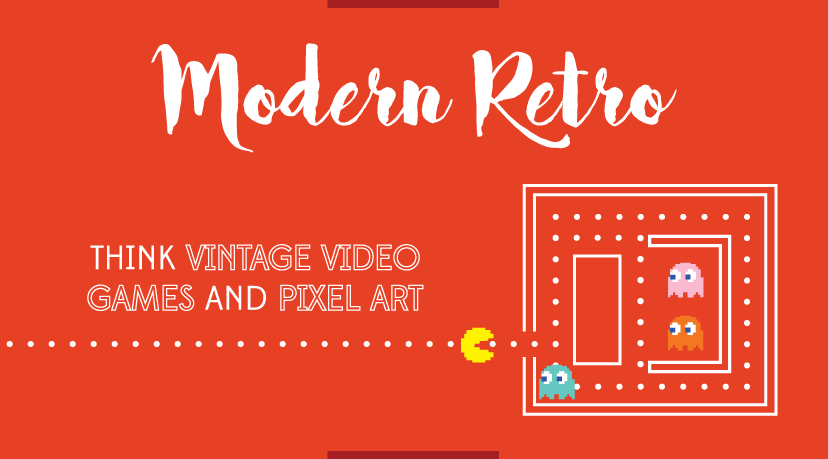
This year will emphasize the modern aspect of retro. I'm not talking vintage 50s and 60s "I Love Lucy" style, but the once-modern styles of the colorful 80s and 90s.
8. An End to Stock
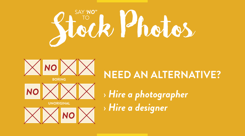
Designers have always known that stock photos are typically boring and unoriginal. (And who doesn't get a good chuckle when different businesses use the same stock photos?) People can start to see the same images everywhere!
So, what's a better alternative? Hiring a professional photographer who can take photos to custom-fit your brand, or maybe hire a designer who can create a unique illustration to show off your organization's personality and style (while keeping on trend)!
9. Video
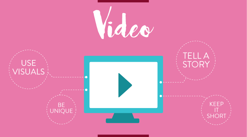
You know those cool background videos on websites–the ones that take forever to load but once they do they're awesome? Hopefully 2016 will change that by keeping the awesome, but ditching the load times. But more important is the length. Think shorter–like what you'd see on Vine or Snapchat.
Eye-catching visuals and compelling narratives rendered succinctly are required to put your brand front and center.
Click here to find out more about our video production!
Examples: Fernando Maclen // Follow Your Intuition
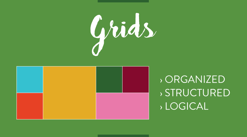
10. Grids
A grid system is a strict framework that helps graphic designers place information on a page in a more meaningful and logical way. The grid has been around for years and is mostly seen in print design. Nowadays, websites like Pinterest have started to adapt to a grid system and this trend will continue to be more prevalent in 2016.
Examples: Flipboard // The Furrow
Note: New Boston celebrates its 10th anniversary this year! In honor of this milestone, we'll feature a "Top 10" of various topics and fields each month. Stay tuned!

