National Logos and Why Brands are Effective
by New Boston on October 25, 2022
There is a common misconception that having a great logo is key to having a successful company or product. Truth is, the logo is only one piece of the equation; it’s the visual mark that we learn to associate with our favorite brands. People didn’t fall in love with Apple, Nike or Coke because they liked the way their logos looked; they fell in love with them because their product added perceived value to their lives
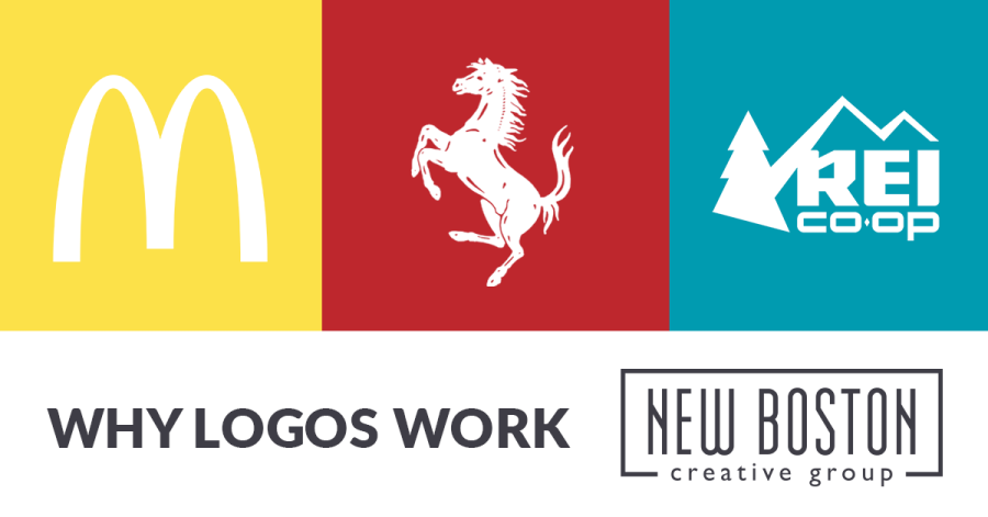
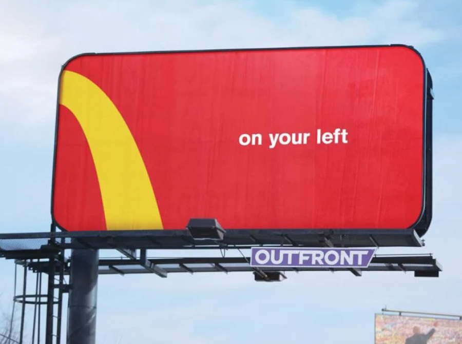
Most successful companies recognize that as their product becomes more popular, their logo will need to evolve, as well as their brand identity. Hiring designers and marketers to keep their image fresh, relevant and professional is a natural progression to ensure the “hook is set” in the minds of their audience. The power of a good brand is undeniable. I’m pretty sure the McDonalds designers were just showing off when they used the color red and a quarter arch on their billboards. It’s impressive to say the least, although there are several national brands that could get away with such a display of brand mastery.
 However, there are plenty of companies that have stayed fast to their initial logos with little or no evolution. If having a bad logo were the end of a product, then there’s no explanation for the success of these brands. They are the misguided who believe a logo cannot and should not ever change regardless of its ill-conceived design. The idea of a timeless logo quite often refers to a company that has stood the test of time, in spite of its logo.
Here are a few examples:
 The Ferrari logo looks like the fort flag of a 10-year-old boy. With its clip-art horse, crayon colors and funky font, it's clear this thing has never passed through the hands of a designer, which is sad because animals, like cars, are the perfect vehicle (no pun) to show off beautiful lines. If people love this logo, it’s because they love the car.
![]() Virgin – the hand-written “I scribbled this on a napkin” logo that screams 1970 … AND THEY LEFT IT LIKE THAT. It was part of a trend that lasted way too long and we were so happy when it finally ran its course (at least designers were). You can call it time-tested; I’ll call it dated with a dose of cheese.
Virgin – the hand-written “I scribbled this on a napkin” logo that screams 1970 … AND THEY LEFT IT LIKE THAT. It was part of a trend that lasted way too long and we were so happy when it finally ran its course (at least designers were). You can call it time-tested; I’ll call it dated with a dose of cheese.
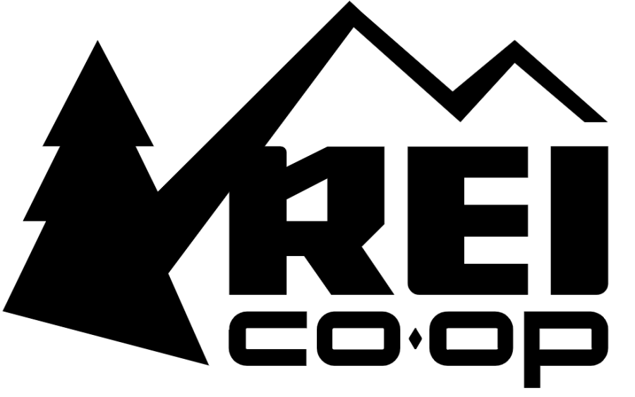 REI – “We’d like a mountain and a tree in our logo.”
Designer – “You should probably just use one or the other.”
REI – “No, we really want people to know we’re outdoorsy.”
Designer – “The mountain would symbolize that.”
REI – “Nah, we need both, shove a tree in there; like the ones we cut out of construction paper as children”
The sad thing about REI is that their logo font isn’t half bad and can easily stand on its own. Redesign — lose the crappy tree.
I could go on, but the point is…your logo should be styl’n, but it doesn’t have to be. An effective brand strategy and how people relate to your product is the key to your success.
Your logo is only one piece of your brand identity, which also includes colors, images, fonts and other visuals you need to effectively market your product. The consistent application of visual components is how we are able to identify McDonalds with nothing more than a color and a piece of arch.
If a customer finds your brand by how it looks, then how your product makes them feel and the value it adds to their life is the reason they buy.
A key component of brand strategy is understanding the 12 main archetypes that represent universal human behaviors and personalities. Originally theorized by Carl Jung, the idea is that people collectively recognize and identify with shared behaviors that define one’s personality. Brands that resonate with a person's self-perceptions are connecting with their audience on a primal level.
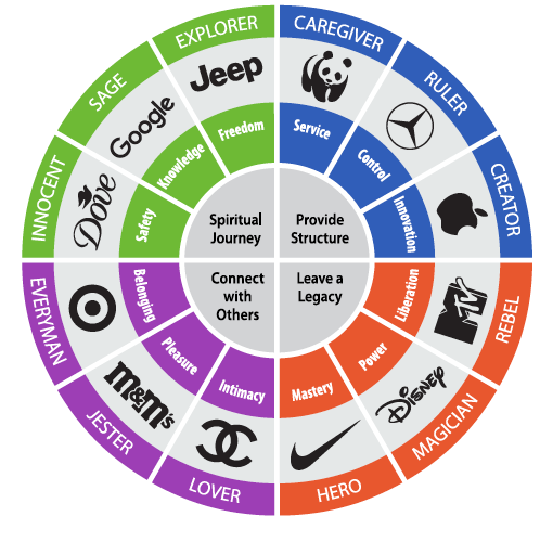 In order to develop a brand strategy, you need to know which personality trait, or archetype, your company represents and how your product validates that quality in the consumer. The graphic below illustrates the main archetypes and the emotion each taps into, as well as an example of a company that reflects that personality.
A brand is what people think of when they hear a brand name. It has two components: how the brand visually appears, which is objective, defined by the logo, colors, fonts and styles; or, how the brand makes them feel, which is subjective and can’t be seen, existing only in our mind.
Referring back to the paragraphs about bad logos, it seems that how we feel about a product is more important than how the brand visually represents itself. I get it; I’d turn a blind eye to a bad logo if someone wanted to hand me a Ferrari. It’s not rocket science.
P.S. NASA’s logo. Holy cow.
Do you need help with your logo? We can steer you in the right direction. (Steer! Like a car! Get it?) Contact us today and we promise to tone down the puns.