Beyond the Menu: Creating a User-Friendly Website Navigation
by Stan Grabowski on March 17, 2015
Imagine going into a large store where you know a bit about what the store sells, but you've never been there before. You might spend a lot of time wandering around, trying to find a particular item. But if someone meets you at the front of the store and asks how they can help, they can guide you through the store to help you find what you want quickly.
When you enter a website, it is much like entering a large store. Using a website's menu is similar to browsing around the many sections of the store. And while a website can't respond to questions like a salesperson can, there are ways to lead your visitors to what they need more efficiently.
The Problem
I've had a lot of web projects in the past start off with a list of pages. The client wants these specific pages, and this information. That list of pages typically turns into a menu hierarchy.
While this kind of planning is important, it can often lead to confusion for the people that will eventually be using the site. They find themselves asking questions such as:
"Where do I find what I'm looking for?"
"What does that menu item mean?"
You've possibly stumbled across those websites. The ones with huge menus that you end up poking around in until you find what you need. It's not very fun. It's not user friendly. And you, the user, should not feel like you're on a scavenger hunt.
So instead of asking yourself what specific pages should be on your site, ask what you can do to make your site more straightforward for the user. Don't think from your viewpoint. Think from your user's viewpoint. Here are a few things to consider:
-
Who's coming to the site? What do you know about them?
-
What do those people want to find, or need to accomplish on your site?
-
How can you get people from your home page to where they need to be quickly?
Now, you may think that your website's menu does that. But unless you've only got a small handful of pages on your site, then it probably isn't that straightforward.
Example
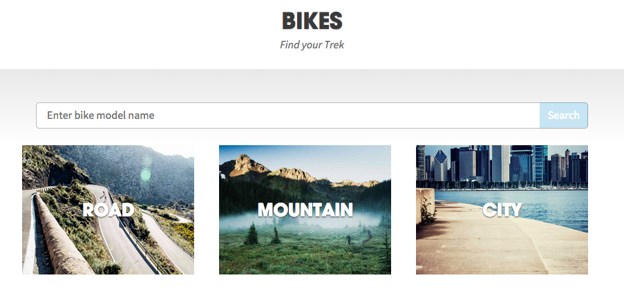
One of my favorite examples of smart navigation is the Trek Bikes website.

This is not on the homepage, but it's an example from their bikes section.
Because of the imagery and text, it is fairly obvious where the user should go. I like to mountain bike, so I'd be drawn to the middle option. And even after you select one of these primary categories, you see sub-categories along with images and descriptions.
They don't just drop you into the whole bike list. They walk you through step-by-step while giving examples along the way. If you clicked on "City" you'd see sub-categories like "Urban Utility," "Fitness," "Recreation," etc., each with an image that captures what you'll be doing on that type of bike, and a brief explanation.
Imagery + simple explanations = a much easier navigation to follow than a long list of menu items!
This is a website that is familiar enough with its main users to break them out into categories and funnel them to where they need to go. Think of your users and customers the same way. What do most of them need to find, buy, or accomplish? What is the problem they are trying to solve, and how can you lead them through your site in order to solve that problem?
Conclusion
Don't let people wander aimlessly through your site. Don't make them click on every menu item until they find what they need. The menu should be their last resort.
Plan and anticipate what the majority of your visitors will want. Offer them simple, guided ways through your site. Make sure the imagery and wording speak to them quickly so they can scan through the page. (Though we've mostly been talking about visual navigation, good content that is optimized with keywords is a key component of site navigation as well.) If your users are sure of what they are clicking on, then they will be less likely to hit the back button.
If your website is in need of a more user-friendly design, let us lend a hand — you can learn more about the web services we offer, see examples of recent projects we've worked on, and then contact us to get started.


