Pro Tips for a Great Email Design
by Stan Grabowski on December 5, 2022
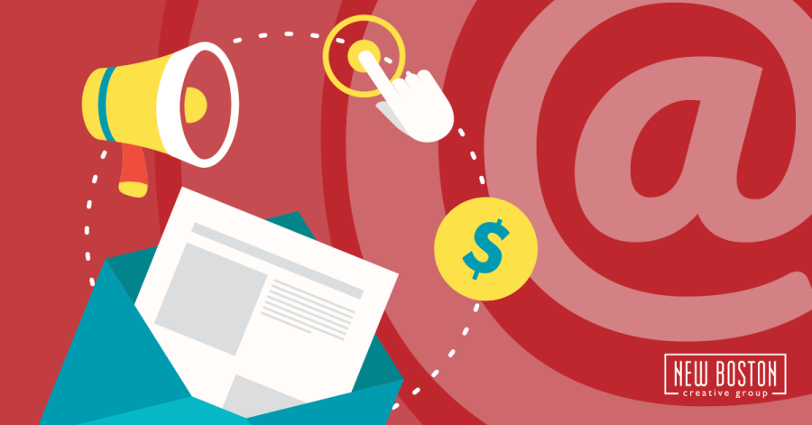
In today’s busy world, keeping your business in front of your target audience is a must. One of the best ways to do this is through an email newsletter, or enewsletter. A great enewsletter grabs the reader’s attention and directs them to your website — here are a few tips for doing just that.
Throughout these tips, keep in mind that a lot will depend on your audience, what service(s) you offer or what product(s) you sell. But getting people from the email to your website is the overall goal. Consider these examples for quick and easy website traffic:
- Talk about your big sale. Include some basic details (how much off, when it ends, etc.), and have a button that takes users to the site. Maybe list a few best sellers and lead customers right to the product page itself.
- Feature an intro to a blog post that talks about your products, industry news, new advancements in technology, etc., and then lead the reader to the full article with an easy-to-tap button.
Include Clear Calls to Action (CTAs)
For each item, whether it be an article, event, item for sale, etc., have a brief, catchy intro and then link to the full info with a button. Make the button easy enough to tap on a mobile device, because a lot of your readers will probably be lounging on their couch with a smartphone.
Give the Text Some Space
Text is important, especially in a newsletter. I get a few newsletters and other marketing emails that have images and text all over, crammed together. If you’re reading something like that on a small phone, it’s going to look like a busy mess. Even on my 24-inch monitor at my desk it can be distracting.
Most email marketing sites like MailChimp or Constant Contact have ways to space text and images out. Look for those options and give the text enough white space so it can get the attention it deserves.
Limit Text in Images
A lot of the email newsletters and marketing I get have images with text as part of the image. That’s not necessarily a bad thing. But some have all the text in images. All. Of. It.
A headline or title isn’t bad (as long as you add the “alt text” to the image), but avoid any more than that. If the image doesn’t load, you’ll be sending empty emails.
Also, if your email doesn’t have any actual text and is just images, you may fall prey to the dreaded spam folder more easily. So be selective with how you use text in an image. Getting that cool font just right may look nifty, but some screen reading software can’t access it, and it might go right to spam where no one will see it anyway.
Get Subscribers to Opt-In and Keep Your List Clean
As you make your list of who to send to, having subscribers “opt-in” can help your open and click rates. When someone signs up, most email marketing systems give you the option to send them an opt-in message, where they can then confirm their email. This ensures it’s a legit email signup and that they did indeed want your newsletter.
Also, make it simple to unsubscribe. Most systems require an unsubscribe link at the bottom, but I do get some emails where it’s so hidden in other text it’s hard to find. And the “mark as spam” button in my inbox isn’t hard to find. So which one will I click if you make it hard for me to leave? You’d rather have someone unsubscribe than mark your finely crafted newsletter as spam.
Keep it Simple
Images and text, along with some buttons, is often all you really need. If you can’t take your own quality photos, there are cheap or free stock image options.
Remember that, on a small phone screen, adding too many design elements can get busy. Likewise, small columns of text can be hard to read.
So mainly just keep your emails clean and easy to scan through, and your subscribers — who have to sift through a deluge of emails every day — will be more likely to find something that interests them!
Review Before You Send
You don’t want to spend time crafting the perfect email just to have something go wrong. While mistakes can always happen, try to minimize the chances by checking your email thoroughly before clicking send.
Here are a few things you can do to check:
- Use your email provider’s built-in tools to see how it will look on a small screen before you send it out. How will your email formatting look on a phone? A tablet? A desktop? Make sure each device looks as good as the others.
- Click on all of the embedded links throughout the email to ensure they take the user to the correct page.
- Send your teammates — or your friends! — a test email to get their feedback. Was everything clear? Did they catch any typos?
Hire a Professional
Okay, so you don’t need to follow this tip if you have a handle on your email communications. But, it can be helpful to have a dedicated team taking care of these newsletters for you. If you need help creating stellar emails, contact us today!