I Like Big Buttons and I Cannot Lie (aka: How to Make a Good Call-to-Action)
by New Boston on August 28, 2015
I love to click! It’s what I do all day long. I click to check on social media posts for a client. I click to make sure links work the way they need to. I click to order my pizza. I click to subscribe to email lists, to download ebooks. Clicking is a significant part of my daily routine.
But I am a PICKY clicker. Yes. Yes, I am. Picky, picky, picky.
And so is my husband.
And so are my friends.
And so are my kids.
And so are my parents.
You need to know about people like me (and my husband, and my friends, and my kids, and my parents)! You need to make sure your website and your posts and your blogs have buttons that MAKE PICKY CLICKERS CLICK!
So, what gets my trigger finger itchy, you ask? A big, colorful call-to-action button that tells me quickly and clearly what to do! I feel cheated these days if I get to the end of a blog or post or even a book on my Kindle and no one has given me the next step. Something to DO.
Let me call your attention to the bit about call-to-action. Yes, these are the “bat-signals of your marketing efforts,” as Paige so eloquently puts it in her CTA blog. You need to give your audience something to do and a way to do it, or your efforts are all for naught. Calls-to-action are important. And picky clickers know what they want in their CTAs.
Picky clickers want your calls-to-action to:
- Be buttons (when possible and appropriate): Yes, you will see quite a few in-text links in OUR blog posts, but we also like to give you something to DO when you are finished — like click a button, one big, clearly labeled action button.
- Look like buttons: This may seem like a no brainer, but you’d be surprised at the number of seahorse-shaped buttons swimming through the interwebs. Your users don’t want to spend time figuring out if it is a real button or some fancy decoration; they just want to click. So make it easy. Buttons should look clickable. They should be rectangular (ish) or circular (ish) like a real elevator button, or a “Launch Rocket Now” button.
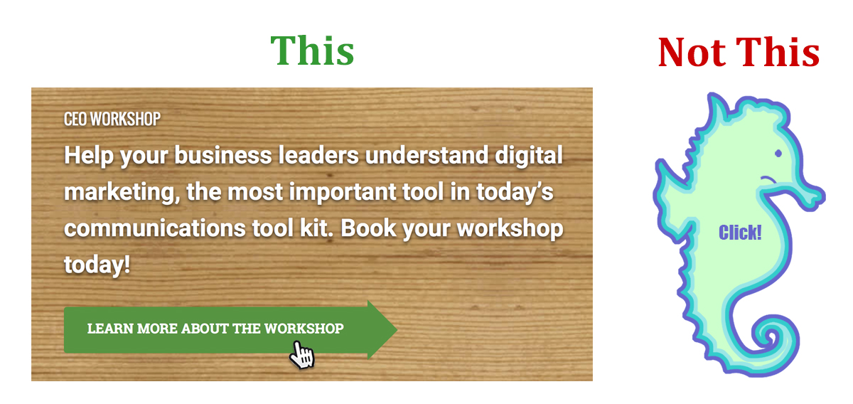
- Be clearly labeled with a verb (you know, an action word because it’s a call-to-action … see what I did there?): It should be obvious what clicking that button will do. Keep the copy short, sweet, specific, and active. “Browse backpacks” “Read more!” “Choose my color” “Join the e-club” “Enter to win!” “Watch more videos!” “Build my truck” “Get Started” (Bonus points if you use keywords for boosting your SEO!)
- Be sized appropriately: We need to go with the Goldilocks-size button here — not too big, not too small, juuuust right. Too big will overwhelm the rest of the (really important) content on the page. Too small will make it so you can’t fit a good call-to-action inside it. Juuuust right and people like me will click, click, click!
- Have a comfy home near the content it reflects: Don’t hide your button under a bushel (or in a corner). Let it shine, let it shine, let it shine! Your user should view your CTA button as the next natural and logical thing to do.
- Be honest: There should be no surprises. If your button says it will do something, that’s what it should do, nothing different. If your button says “Register Today,” it better darn well take me to a place where I can complete my registration online. If it offers “Schedule My Appointment,” I’d better be going to a page where I can schedule online.
- Be visually distinct (and beautiful): Your call-to-action button should fit into your website’s color palette. But you still want it to be noticed. A contrasting color is the most likely candidate for a great button color. Give it the squint test. Step back from the screen and squint. Does your button stand out? (The same holds true for in-text links. Ask yourself if they are visually distinct. Too often, the link is so similar in color to your normal text, your audience doesn’t even know they can click on it!)
These simple strategies will keep those picky clickers like me looking at more and more content on your site.
Need help with more than just buttons?
- Want people to find your website easier (or more often, or at all)?
- Want to reach your customers/clients where they spend their time online?
- Want to figure out why you are successful online (or not)?
New Boston Digital Marketing Academy offers hands-on workshops that help you get answers to these questions and be more effective online.
Whether it is bumping up your social media presence, getting found by search engines, or getting down and dirty with all the information you can gather about who is visiting your website, New Boston Digital Marketing Academy is your ticket to moving forward in this digital world.